Tips

The Aluminum rods of British Pavilion in Shanghai are void or soild?
Showing posts with label Construction. Show all posts

Monday, October 11, 2010

MUMUTH Music Theater


By Victoria Newhouse

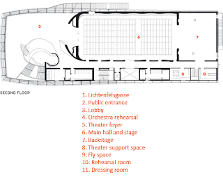
In the daytime, unStudio’s Haus für Musik und Musiktheater (MUMUTH) is a mysterious presence among historic houses on Lichtenfelsgasse Street in Graz, Austria’s second-largest city. A fine, stainless-steel mesh attached to gently curved steel frames completely masks the four-story, glass-and-steel structure as well as the spectacular concrete spiral that is the heart of the building. During the day, when only students and staff of the Kunstuniversität Graz (KUG) use its teaching and administrative spaces, they enter the building from the adjacent park at the west. But at night, interior lighting brings the building’s public identity as a theater to life, and the visitors enter the music house by a separate entrance on the south.

MUMUTH resulted from a 1998 competition held by KUG (also known as the Universität für Musik und Darstellende Kunst) that called for a theater for its 2,100 international students as well as rehearsal rooms, workshops, and a lounge. (The theater will also be leased for nonuniversity events.)

As a response to this program, the Amsterdam firm’s principals, Ben van Berkel and Caroline Bos, divided the building structurally according to a concept van Berkel calls “blob-to-box and back again.” The foyer and public circulation spaces at the south form the blob; the theater at the north is the box. Joining the two—and organizing the whole—is a concrete spiral much like a Möbius Strip, a single-surface form the architects explored in their Mobius House built in Het Gooi, the Netherlands, in 1998.

Van Berkel compares the twisting structure to serialism in contemporary music, since it shares the ability to absorb and regulate intervals, interruptions, changes of direction, and leaps of scale without losing its continuity. The architect’s convincing parallel between architecture and music was the determining factor in the jury’s decision in his favor. Indeed, although his helix is related to different musical principles, it bears a striking resemblance to the composer/architect Iannis Xenakis’s polytopes of the 1960s, as he called his conceptual models for electronic light and sound projection.

A number of factors delayed the beginning of construction of MUMUTH. First, the city did not want to detract attention from other projects it was sponsoring, such as Peter Cook and Colin Fournier’s nozzled, biomorphic Kunsthaus Graz [record, January 2004, page 92]. Furthermore, political changes jeopardized MUMUTH’s funding, which was only reinstated after elections in 2005. In the interim, the architects transformed the structural spiral from steel to a composite of steel and concrete. The delay also allowed the installation of new acoustic technology that became available in 2006 and promised to be flexible enough for a range of live acoustic to electronically amplified performances. (The system, and other technology, added between $7wmillion and $10 million to the building’s $23 million cost.)

As the public enters the building for performances, it is immersed in two levels of the dynamic concrete twist around which the massive spiral of the grand stairway rises to the music theater on the second floor and continues upward to a roof skylight. Van Berkel says the form was even more challenging than the spiral ramps of UNStudio’s much larger Mercedes-Benz Museum in Stuttgart [record, November 2006, page 126]. Its dimensions required such precision that self-compacting concrete was pumped from below instead of poured from above. The bold gesture could have done without the spindly red-carpeted, metal-encased stairway that piggybacks the twist from the theater level to the floor above.

Compared with this showy structural tour de force, the sober 450-seat theater appears tame. However, its technology makes it anything but. Granted, the auditorium is a simple black box, except for the dark eggplant walls articulated by a shallow, three-dimensional lacquered wood of the silk-screen pattern printed on the building’s glass curtain wall. This modest setting, however, may well provide a long-sought answer to the search for a venue that can satisfy any number of purposes.

Until now, that search has yielded no perfect solution. Walter Gropius’s unbuilt Total Theater project of 1927, proposing the mechanical reconfiguration of a theater from proscenium to thrust to arena stages, had by the mid-1950s led to the design of pneumatically adjustable floor modules. Such modular halls, however, have proved more successful for long-running theater productions than for one-night musical performances, owing to the prohibitive cost of physical modification. Furthermore, their acoustics need to be adjusted physically. Zankel Hall in New York City’s Carnegie Hall, for example, remains for the most part unchanged for public performances since its inauguration in 2003.


MUMUTH’s 108 floor modules—measuring in length from about 3 to 6½ feet and able to rise hydraulically to almost 11 feet and higher at the back—follow these precedents, albeit with easily moved seating. “The room is a stage that will be reconfigured at least three times a week,” says Georg Schulz, the university rector. An instance of such a change was the performance of Bach’s St. John Passion given in April 2009, in which the stage configuration echoed the Möbius Strip. Van Berkel designed the floor modules to be raised in a double-eight design and to stretch throughout the hall to place the choir within the audience.

The real innovation is the theater’s Meyer Sound Constellation system that can vary reverberation time electronically from just over one second (without the system) to over two seconds to suit a gamut of performances, from the spoken word to chamber music, symphonic music, opera, and jazz. Theoretically, the room could be adjusted electronically so Bach’s St. John Passion, for example, would sound much as it did in the larger church for which it was created. Assuming that current resistance to electronic enhancement of classical music can be overcome, the combination of refined electronic acoustics and inventive architecture could be thrilling for future performances.

Cathedral of Christ the Light


By Suzanne Stephens

It comes as a shock to discover one of the Bay Area’s most riveting examples of recent architecture is not the work of international highfliers imported to San Francisco and its environs to rev up the local landscape. To be sure, Bay Area architects have long held their own with a calmly cool regional Modernism. But with current media hoopla, cultural institutions by Herzog & de Meuron, Renzo Piano, Daniel Libeskind, and Tod Williams Billie Tsien have tended to overshadow local architects’ achievements—at least until the conical and chiseled Cathedral of Christ the Light opened a few months ago in Oakland. Designed by the San Francisco office of Skidmore, Owings & Merrill (SOM), with Craig Hartman, FAIA, as the design partner (and Kendall Heaton Associates the architect of record), the glass, wood, and concrete structure reaffirms the power of an abstract Modern form to function as both a spiritual and civic presence. It also evokes the manipulation of light and space memorably demonstrated by the modern religious architecture of Eero Saarinen, Louis Kahn, Jørn Utzon, and Frank Lloyd Wright. Although Hartman and SOM received accolades for the International Terminal of the San Francisco International Airport (2000), this poetically ethereal cathedral clearly represents a different kind of architectural achievement.

Interestingly, Santiago Calatrava had originally won the commission from the Oakland Diocese to design the chief church for 60,000 Catholics when it lost its Francis de Sales Cathedral to earthquake damage in 1989. Calatrava and SOM, along with Ricardo Legorreta (now Legorreta + Legorreta) had been asked to come up with schematic designs from a group that included Foster and Partners, and Kevin Roche, FAIA. But by 2003, after some fits and starts involving site changes, Calatrava and the diocese dissolved their union. The church officials turned back to runner-up Hartman’s scheme.

In designing the 226,000-square-foot cathedral complex for the 2.5-acre site, SOM positioned the sanctuary on a poured-in-place concrete podium containing a mix of uses, including a legal clinic, a health clinic, a conference center, and administration offices for the diocese. An interior courtyard embedded in the podium along with skylights provides ample daylight to the underground recesses. Rectilinear outbuildings—an archive, a rectory, a shop for the church, and a café—sit atop the podium, while a mausoleum is located directly under the sanctuary. At this point, a circular chapel and campanile have not been added to the cathedral, which is now estimated to have cost $112.9 million for the construction plus fittings, furnishings, and equipment.

An abstracted curvilinear form had appealed to Hartman from the start: When the late architecture critic Allan Temko, an adviser for the cathedral’s architect selection, added SOM to the list, Hartman asked Walter Netsch, long the design partner of SOM’s Chicago’s office, about his inspiration for the striking Cadet Chapel at the Air Force Academy (1962). Netsch cited the 1958 translation of The Church Incarnate, written by German church architect Rudolf Schwarz (originally Vom Bau der Kirche, 1938). Schwarz had proposed designing a church with a circular plan around the altar, rather than relying on the typical Latin or Greek cross. Hartman, conscious of the diocese’s adherence to the Vatican II’s stated mission to promote a sense of community through church design, took for his plan the ovoid form of the vesica pisces—an intersection of two circles and a historic Christian symbol.

The resulting sanctuary, 118-feet high on the exterior and seating 1,350 inside, brings together two geometrical forms, the cone for the glass carapace, and a sphere for the ribbed and louvered Douglas fir inner structure, both of which rise from an oval poured-in-place concrete base. Called the reliquary wall, it contains chapels, a vesting room, and a sacristy. (For structural and mechanical details, see page 88.) In order to endow the sanctuary with a luminous quality yet avoid heat gain and glare, Hartman and his team developed a diaphanous outer skin that combines fritted glass (opaque and translucent) and translucent film laminated on glass, with clear low-E glass. The geometric pattern for the fritting is distributed in a way that “looks organic—like the bark on a tree,” says Hartman. White aluminum mullions and transom bars, based on a 10-by-5-foot grid, frame the glass; the mullions extend past the top of the enclosure to give a sense of verticality to the tapering form. Atop the structure, a vesica pisces–shaped oculus of dichroic glass admits more light to the sanctuary, albeit filtered by faceted aluminum panels. In bright daylight, the veil-like glass enclosure can look too uniformly opaque yet too lightweight—like rice paper stretched over a large drum. But by night, the wood frame begins to show from within: The skin reveals as it conceals.

The detailing of the glazed, monumentally abstract artifact, as complex as it is, does not fully prepare the visitor for the experience of entering the cathedral. The procession begins at the street, with a walk up a plain concrete ramp (called Pilgrim Path, referring to the history of pilgrims climbing up a path to a cathedral atop a hill). Where the ramp terminates at the south entrance, visitors shift their axis of movement as they are drawn into a low-ceilinged vestibule. And then suddenly, the space explodes dramatically upward in a luminous hall framed by semicircular pews and curving lattice walls.

The major surprise comes from encountering the 58-foot-high apparition of Christ, based on a Romanesque sculptural relief (1145–1150) on the Royal Portal of the west facade of Chartres Cathedral. Rather than erecting a stained-glass window behind the altar, the architectural team took a digital image of the Chartres Christ and created a mammoth artwork with 94,000 laser-cut perforations on 10-by-5-foot anodized-aluminum panels. Light admitted through the translucent frosted film on the glass of the north-facing Omega Window seeps softly through the panels. The process enhances the image’s ethereal quality: The Christ seems to float like a hologram above the circular altar.

Chapels within the thick gray concrete reliquary wall surrounding the sanctuary contain paintings and sculpture displayed dramatically against a background of polychromed Venetian plaster surfaces. Hartman designed the mausoleum underneath to respond to the sanctuary’s oval plan and reinforce the sense of integration between the two levels. Here, the pristine craft of the Douglas fir wood, the sheen of the polished granite floor, and the dramatic use of lighting bring out the stateliness of the 1870 stained-glass windows taken from the previous church.

The light, space, and overall architectonic quality of the cathedral create the appropriate religious setting without its architecture being subsumed by an intensely figurative program of art. To be sure, the architecture belongs to the Modernist tradition. But its resonance also relies on its strong underpinnings in traditional religious architecture, such as the concentric plans of Renaissance chapels or the manipulation of light in Baroque churches. Forceful, spiritual, inventive, the cathedral retains an admirable typological continuity with the past.


Sunday, October 10, 2010

Contemporary Jewish Museum


By Sarah Amelar

Daniel Libeskind, by happenstance or design, has practically become the official architect of Jewish museums worldwide, but that trajectory was near its beginning when he received the commission, in 1998, for San Francisco’s Contemporary Jewish Museum (CJM). His Jewish Museum Berlin [RECORD, January 1999, page 76] and Felix-Nussbaum-Haus, in Osnabrück, Germany, were not yet complete, and his Danish Jewish Museum barely conceived. While those European institutions would rise in the dark shadow of the Holocaust, he and the museum determined that the CJM’s building should, instead, celebrate California’s far brighter Jewish history.

But the CJM is a curious institution that “doesn’t fit into any particular category,” admits its director, Connie Wolf. “It’s not, strictly speaking, a museum of art, or of history, or of the Holocaust, or of Judaica.” Its stated mission is to explore Jewish culture, history, and tradition through the prism of contemporary art and ideas. Like a kunsthalle, it has no permanent collection. And when founded, in 1984—occupying cramped quarters in a Financial District office building—it also had no architectural identity.

The site of the CJM’s eventual home made it tricky to carve out a distinctive, even visible, physical identity.

In the mid-1990s, the museum had acquired, for adaptive reuse, the long-vacant Jessie Street Power Substation, a landmarked, 1881 redbrick structure. Though embellished with terra-cotta swags and cherubs by architect Willis Polk, who restored it after the 1906 earthquake and fires, the power station stood publicly off limits, nearly hidden from view along a narrow lane.

Some eight decades after literally empowering the city’s rebirth, the decommissioned substation ducked the wrecking ball, when much of the neighborhood was razed for the Yerba Buena arts district. By the time the CJM arrived on the scene, the building was virtually locked in by an impinging, collagelike cluster of eclectic neighbors, including a large church and three modern high-rise hotels.

“A survivor with an auspicious history, the power station helped fuel San Francisco’s success,” says Libeskind, who credits that distinction (and the city’s positive Jewish history) with inspiring his new sections for the building, based loosely on the Hebrew letters, chet and yud, spelling chai, or “life.” Now, in trademark Libeskind style, the historic structure’s placid, redbrick shell erupts with jagged, skewed forms—the yud (an off-kilter rhomboid) and chet (a slanting, toppled L), both clad in blue steel—leaving the line between old and new decisively unblurred. Accentuated by the existing facades’ impeccable restoration, this radical juxtaposition has been likened to an iceberg crashing through a ship’s hull.

Yet, despite its sense of dynamic collision, the new building’s arrival in San Francisco was anything but abrupt. Through a protracted, 10-year process, the CJM engaged Libeskind only after parting ways with architect Peter Eisenman, whose scheme included a huge outdoor screen broadcasting breaking Mideast news. There was also a short-lived merger with Berkeley’s Judah L. Magnes Museum, which would have brought a major permanent collection of Judaica. Finally, in a changing economic climate, Libeskind’s ambitious design got downsized from 110,000 to 63,000 square feet.

Finally completed last June, the $47.5 million museum, tucked behind the historic church, is reached via a new public entry plaza. Wedged in tight, the building is never fully visible from any single vantage point. So the architecture needed “to mediate and assert its place in the city,” says Libeskind, “just as the museum, in affirming its institutional identity, struggles to mediate between different eras and histories.”

The building relies not only on the sharp-edged diagonals—sometimes a shortcut to dynamism and architectural self-assertion—that have been a mainstay in Libeskind’s work, but also on abundant calligraphic symbols, some more convincing than others. Beyond the vertical yud (housing a gift shop below and a gallery above, at the building’s west end) and the horizontal chet (containing community and exhibition spaces that spike above the original roof plane), the entry hall greets visitors with another spelled-out symbol: the Hebrew word PaRDeS, in jagged, fluorescent-illuminated letters across a 140-foot-long, canted wall. As an acronym, the letters refer to four levels of scriptural interpretation; as a word, they allude to paradise. Not readily legible, it’s explained on a wall plaque. In like spirit, the auditorium’s ceiling bears crisscrossing lines, taken from a 15th-century map of routes to the Holy Land, but who would guess it?

These abstract symbols elude deciphering, even for people familiar with Hebrew (or Renaissance migration paths). The notion of generating architecture from letters has even seemed hokey to some visitors. But is this symbolism meant to be subliminal? Or karmic? “Neither,” says Libeskind, who similarly based his Danish Jewish Museum on the word mitzvah, meaning “good deed.” “There is a mystery about the text. The Hebrew alphabet isn’t just a set of signs—each letter has divine meaning,” the architect maintains, adding that every character not only tells a story, but is also intrinsically spatial. “Though,” he advises, “it’s best not to think about it too much—better just to experience the spaces.”

On its own physical terms, free from the weighty promise of hidden meaning, the museum offers a small collection of largely successful spaces. Roughly half the size of Libeskind’s original scheme, the CJM is modest in program: the entry hall, auditorium, and museum store, plus a gallery, café, and education/activity rooms at grade; and two second-floor galleries. In contrast to Berlin’s intentionally dark and disturbing Jewish Museum, marked by severe spatial fragmentation and an unrelenting sense of void, San Francisco’s offers a more luminous and fluid spatial sequence.

Most striking are the entry hall and Yud Gallery. Two-hundred-feet long and 50-feet high, the reception hall is entered along the power station’s long, south side, through existing ornate portals. Libeskind, working with WRNS Studio, replicated the industrial steel catwalks and trusses of this former battery hall, leaving the brick shell’s interior exposed, in counterpoint to his own white drywalled surfaces. He laced together old and new with steel I-beams that shored up the shell during construction and now provide seismic bracing. Maximizing daylight, the original skylights are restored and the high windows now extend to the floor. The web of structural and mechanical elements, high overhead, evokes an energy plant’s industrial innards, while the play of daylight and complex shadows animates the canted PaRDeS Wall.

A grand stair, paved in white terrazzo, leads up to the second level. Around the stairwell, the prismatic convergence of diagonals recalls such Libeskind work as the Denver Art Museum [record, January 2007, page 84], but this calmer, tuned-down version (likely the fortuitous result of cutbacks in the scheme) benefits from the absence of exuberant excess. And since Wolf requested 90-degree walls in the galleries, her museum avoids the challenges of Libeskind’s Denver or Royal Ontario museums, where dramatic diagonals compete with the art. The CJM galleries—comprising only 9,500 square feet—are reasonably proportioned, allowing for varied arrangements of temporary partitions.

While the activity and education rooms, sequestered to the ground floor’s darker center, retain a community-basement feel, the Yud Gallery on the second floor has a magical quality. Like a sculpture (though, one might argue, a self-indulgent one, given its limited use as a gallery), this 2,200-square-foot space fills the peaked upper half of the yud rhomboid, where 36 deep-set windows penetrate the slanting walls. Daylight, entering like confetti from multiple angles, casts fleeting diamond shapes. (This compelling effect is eclipsed only by utilitarian suspended track lighting.) Here, wisely, the museum will exhibit only sound pieces and host musical performances, wedding parties, and other receptions.

The interior, in contrast to the museum’s more jarring exterior, mediates subtly between old and new. Logically relating to the eclectic and encroaching urban context, the radical exterior juxtapositions also enable the museum to elbow out its territory—not merely asserting identity, but calling attention to itself in shining blue steel. The interior journey is more nuanced, never losing touch with the former battery hall, powerfully visible from second-floor overlooks. The emphatic exterior allows the architecture to be less aggressive, more gracious and self-confident inside, breathing chai into the power station’s once withering remains.

Saturday, October 9, 2010

The Art Institute of Chicago–The Modern Wing


By Josephine Minutillo

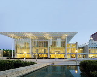
Here we go again—another art museum, another building by Renzo Piano. With the completion of the Broad Contemporary Art Museum in Los Angeles last year and plans for an overhaul of the Harvard Art Museum in Boston and a new branch of the Whitney Museum in New York City proceeding, the Pritzker Prize–winner has enjoyed a near monopoly among architects for the highly coveted building type, especially here in the U.S. So much so that interest in the buildings themselves has begun to wane. Ten years in the making, the new wing at The Art Institute of Chicago has been caught in the middle of that dwindling enthusiasm. Commissioned in 1999, the same year Piano was hired for the High Museum expansion in Atlanta [record, November 2005, page 130], the Modern Wing finally opened its doors in May. But given the sheer size of it, and its prime location between the Art Institute’s landmark structure on Michigan Avenue and the public paradise of Millennium Park, the new wing is not just another building.

Originally intended as a small addition on the southern end of the museum’s site, as plans for Millennium Park firmed up, the building’s location shifted to Monroe Street, across from the new civic center and directly facing the Pritzker Pavilion, Frank Gehry’s billowing outdoor concert venue. “Having seen the Menil Collection and his other museums, we knew Piano could make great spaces for art,” recalls James Wood, the Art Institute’s former director. “But he also had a record as a planner beyond individual buildings. The Modern Wing needs to bind the Art Institute to the heart of the city.”

Along with the move came a much grander building scope, more than tripling in size, to 264,000 square feet of pristine galleries and a sprawling education center, housed within a series of boxy, glazed volumes beneath Piano’s familiar, natural-light-diffusing canopy, or “flying carpet.” Opposite the sculpture terrace and upscale, rooftop restaurant (amusingly called Terzo Piano, a nod to the architect and Italian for third floor), the Nichols Bridgeway—the first large-scale footbridge designed by Renzo Piano Building Workshop (RPBW)—reinforces the visual connection to Millennium Park with a physical access.

RPBW also creates a strong connection to the historic buildings—the original structure designed by the Boston firm Shepley, Rutan and Coolidge for the 1893 World’s Columbian Exposition, and later additions—pulling off a seamless interior transition between old and new despite vast differences in material and scale. On the exterior, the new wing’s Classicized Modernism pays homage to the Beaux-Arts building without upstaging it.


Museumgoers who enjoy losing themselves in the art, and in the museum itself, are best advised to visit the older buildings, whose galleries were completely reorganized and thoughtfully renovated with the expansion. Piano’s highly rational, modular galleries are too compartmentalized to allow for that sort of aimless wandering. But the new building does take cues from its predecessors. The atriumlike Griffin Court matches, in spirit at least, the Grand Staircase that welcomes visitors at the Michigan Avenue entrance. It far surpasses it, though, in breadth. Running the length of the new building, the soaring, double-height, skylit volume serves as the main artery of the Modern Wing, providing access to first-floor galleries, visitor services, the museum store, and the 20,000-square-foot education center, which replaces a basement one half its size. A suspended staircase—whose all-glass railings make it appear to float within the immense space—seems to be the preferred means of access to the second- and third-floor galleries, though the ride in the glass-enclosed elevator offers views over the Pritzker Garden, an outdoor seating area.

Despite the heavy traffic through these spaces in the weeks following the opening, the Modern Wing achieves an unexpected serenity, due in part to its acoustical strengths, but more than that, to an overall design that seems effortless in its simplicity. Circulation, on the other hand, is not always as effortless. Those arriving via the footbridge descend three flights by escalator to enter the museum through the tight coat-check area. From the opposite end, with no direct access between the third-floor galleries and the sculpture terrace and restaurant, visitors are forced to travel back down through Griffin Court and up a single elevator, which, given early crowds, can lead to a wait.

Most visitors, however, are in no hurry to leave those third-floor galleries, the highlight of the new building. It is here that the flying carpet works its magic. Beneath this canopy of aluminum blades designed to capture north light, the Brancusis, Picassos, and Giacomettis on display glow within a luminous box. The veiled translucency—a scrim hovers beneath the glass ceiling—imbues these spaces with a celestial aura, even on overcast days or during a downfall, though according to Piano, “the sun gives it life.”

Piano has incorporated light-filtering canopies in many of his museums, including such small art galleries as the one atop his Lingotto Factory Conversion in Turin, Italy, its flying carpet perhaps most similar to the one at the Modern Wing. “The advantage in Chicago is that the city was laid out according to the cardinal directions; north is true north,” Piano says. He also admits that other changes in the design of these canopies evolved due to increased attention to sustainability. “That was not as much of a focus years ago, and some of the earlier galleries experience heat gain.” Though the Modern Wing is seeking LEED Silver certification, it has drawn criticism for not being green enough, especially for an architect, and a city, known for their sustainable practices. Visitors have expressed their aversion to the vertical shades, which the museum has so far kept drawn over the glass walls until evening hours.

Where the Modern Wing succeeds most, like Millennium Park across the street, is as a civic space. At $300 million, it may, sadly, be the last of its kind for a while. And as different as the Modern Wing is from Piano’s first museum—Paris’s revolutionary Pompidou Center, designed with Richard Rogers—it plays a similar role as a magnet for the masses. Even the Nichols Bridgeway, which when seen from afar may appear as an awkward appendage or an afterthought, has its merits. Generously scaled, the experience of walking over it is a thrilling one in Chicago, with incredible views of Lake Michigan and the city’s famous skyline. Its muscular profile, together with the templelike building, is a fitting addition to that skyline, responding to Chicago’s rich architectural heritage, and setting the stage for its future.


Sunday, October 3, 2010

China Central Television Headquarters-1


OMA and Arup reimagine the skyscraper as a giant loop rather than a tower.

By Janice Tuchman - This is an excerpt of an article from the July 2008 edition of Architectural Record.

A radical, looping structure, the headquarters of China Central Television (CCTV) stands as an antidote to the typical skyscraper. With its dramatic overhang suspended 36 stories in the air and a diagonally braced, continuous-tube frame expressing the forces of its structural system on its facade, it has become a Beijing landmark even before its completion.

Although the client is a subministry of the Chinese government and accordingly reports the official positions of the Communist Party, it broadcasts mostly a mix of comedies, dramas, and soaps. Yes, it listens to Chairman Hu Jintao; but it also must appeal to an upwardly mobile public. CCTV’s leaders see the new building as one way of grabbing their viewers’ attention.

Rem Koolhaas’s Office for Metropolitan Architecture (OMA) won a design competition for the project in 2002, working with Arup for a range of engineering services and in alliance with the East China Architectural Design & Research Institute (ECADI), which became the local design institute for both architecture and engineering. At that time in Beijing, there was “a vision that everything here would disappear and be replaced by a forest of skyscrapers to become the city’s new CBD,” says Ole Scheeren, OMA’s partner in charge of the project and head of the firm’s Beijing office. OMA had watched over the years as skyscrapers had devolved from their original role as catalysts of urban development to just commercial tools for maximizing profits. In the process, clients and architects had become increasingly desperate to call attention to their projects. As Scheeren puts it, the “race for height” had become pointless, as one building taller than the last was announced before the preceding one was complete. He noticed a “visual deafness” to such buildings, which look the same from all directions. OMA wanted to reengage city space in a way that would “proclaim” the building’s inner workings. It proposed a loop of interconnected activities where the “linear principle of hierarchy is dissolved in a circuit of equal parts without beginning or end, without top or bottom,” explains Scheeren.

As designed, the CCTV headquarters combines offices, space for news gathering and program development, studios for production, and facilities for broadcasting—in a continuous loop that runs through the project. The idea is to break down organizational silos and spark creativity and collaboration. The project includes a landscaped media park adjacent to the tower and a second building, called the Television Cultural Center (TVCC), which has public facilities, such as a hotel, a theater, restaurants, a ballroom, and conference rooms. A third building—circular in plan and just a few stories high—houses mechanical, electrical, and energy services for both high-rises.

Rising 768 feet, the 5.1-million-square-foot main CCTV building comprises a pair of towers sloping 6 degrees on both X and Y axes, a 9-story base connecting the two towers, and a 13-story “overhang” that connects them starting at the 36th floor. Scheeren calls the overhang an “urban plateau” that lifts space off the ground but also makes it accessible to the public. The base and towers will define a public plaza that will sit above four levels below grade. Although most of the building will be reserved for CCTV employees, the public will have access to a circuit offering glimpses of the company’s activities—from broadcasting and production to welcoming actors and celebrities. This public loop will include an observation area in the overhang with views across Beijing and even straight down onto the plaza through three circular “windows” in the floor.


Kanagawa Institute of Technology Workshop


Junya Ishigami distills architecture to its bare minimum at the Kanagawa Institute of Technology Workshop.

By Naomi R. Pollock

Occasionally a building emerges that seems to transcend architecture’s inherent limitations. Tokyo designer Junya Ishigami’s Kanagawa Institute of Technology (KAIT) Workshop is one of those buildings. Articulated with minimal means—exterior walls of thin glass and interior clusters of slender white columns—Ishigami’s ethereal structure is barely a building at all. While the transparent enclosure exposes everything inside, the delicate steel columns define scattered oases of open space, each one a different functional component. Awash in soft daylight admitted by glass bands overhead as well as the building’s transparent envelope, Ishigami’s meandering interior landscape creates the ambience of a tree-filled forest, not a college classroom.

A stellar debut, KAIT Workshop is the 34-year-old architect’s first realized building after launching his practice in 2004 following a four-year stint working for Kazuyo Sejima. More recently, he authored Japan’s pavilion at this year’s Venice Biennale (page 77). Like the pavilion, the 21,410-square-foot workshop is modest in scale. Yet this single-story glass box is the centerpiece of the school’s 32-acre campus, whose 40-year-old buildings are currently being replaced one by one. When this ambitious makeover is complete, the workshop will be visible from KAIT’s main gate, where its 5,000 budding engineers and scientists pass each day. Located in Atsugi, an exurb 20 miles west of Tokyo, KAIT, like most Japanese universities, is a commuter school. Though Ishigami’s parallelogram-shaped building gently challenges the rectilinear grid of pathways uniting the campus, it fits comfortably within the existing walkways encircling its site. The building has openings on all four sides, but its main entrance, indicated by an indented doorway and thin steel canopy, is closest to the campus gate.

Open to all KAIT students, the workshop accommodates nonacademic, creative pursuits ranging from molding silver pendants to assembling solar-powered cars. Daylight floods the building during school hours, while ceiling fixtures and task lamps enable the factory-like facility to operate long after classes end for the day. The one-room building contains 14 freely arranged, open spaces. These include a check-in area, denoted by an Ishigami-designed, donut-shaped counter, as well as specialized areas for pottery, woodworking, computer graphics, metal casting, and other media. There are also four multipurpose work spaces, a small supply shop, and an officelike alcove for the facility supervisors. Ishigami eschewed organizational devices, such as structural grids, proscribed circulation paths, and even walls (the closest lavatories are next door). Instead, he used rectangular columns, furniture of brown wood or white steel, freestanding HVAC units, and potted plants to modulate the whole 16-foot-high space.

“I wanted to create a building where it isn’t clear if there are any rules at all,” explains Ishigami. Yet it took a lot of work to reach this objective. In response to the client’s request for many small spaces instead of one big studio, the architect started with a 13-foot grid of rectilinear columns but quickly found this framework too limiting. So he made incremental modifications to the pillars’ positions, dimensions, and orientations. This enabled him to focus on qualitative criteria—such as the size and distribution of open areas and their relationship to one another—and to sculpt the space as if it were clay.

A labor-intensive process that went on for three years, Ishigami’s rigorous design phase required endless iterations involving 1,000 study models of various scales and drawings—both CAD-generated and, especially, hand-drawn—that enabled the fine-tuning of multiple variables at once. The completed building’s 305 columns appear randomly distributed and arbitrarily shaped—290 variations of a quadrilateral—but were, in fact, very deliberately designed.

“Due to the complexity of the columns, it was important to keep the structural system as simple as possible,” says structural engineer Yasutaka Konishi, a contemporary of Ishigami’s who worked on SANAA projects during his five-year tenure at Sasaki Structural Consultants. It consists of three main steel components: a conventional two-way roof frame, 42 compression columns for vertical loads, and 263 post-tensioned columns that carry horizontal loads like mini sheer walls. Though both types of columns are anchored with simple concrete footings, the compression and tension members connect to the roof frame with welded and pin joints, respectively. Because many of the supports do not align with the roof’s 5-by-3-foot girder grid, Konishi inserted extra beams to bridge the gaps.

Despite their separate roles, the tension and compression members look the same to the naked eye. “I was striving for ambiguity even among the columns,” explains Ishigami. But due to their oblong shapes, individual columns may appear different depending on the visitor’s viewpoint—an illusion that compounds the intricacy of Ishigami’s composition. Coated with white paint, each column is actually a slice of steel plate. Cut in various widths from slabs of three different thicknesses, each was tailored to the architect’s exacting specifications. This unusual fabrication technique accommodated every permutation from the thinnest tension member, measuring 0.63-by-6 inches (16-by-145 mm), to the thickest compression member, measuring 3-by-4 inches (63-by-90 mm).

Construction was equally unorthodox. After workers put compression members and the roof frame in place, they suspended tension members from the girders but did not attach them at the bottom until after weighting the roof to simulate the snow load. “No one had ever built like this before,” says Konishi. “I thought the building might sink or fall over.” But when the weights were removed, the taut steel planes snapped into place and the roof popped up as expected. Made of steel deck with wire-reinforced-glass inserts, the roof tilts slightly to drain rainwater, and weighs as little as possible to handle earthquake forces. The designers put the exterior glass skin on a similar kind of materials diet. It’s a mere 0.39 inches (10 mm) thick, but does require beefy glass ribs for vertical stability.

To blur the boundary between indoors and out, Ishigami eliminated all openings on the glass walls except for doors and a few small floor vents that draw fresh air supplied by roof vents. Like traditional Japanese borrowed scenery, the surrounding landscape serves as the backdrop for the interior. Inside, the columns function as abstract trees and potted greenery—each plant carefully selected by the architect—serves a bona-fide design role, not just a decorative one. By blending architecture and nature in a remarkably fresh and dynamic way, KAIT Workshop plants Ishigami solidly among those Japanese designers striving to reduce buildings to their bare minimum.