Tips

The Aluminum rods of British Pavilion in Shanghai are void or soild?
Showing posts with label skin. Show all posts

Saturday, October 2, 2010

Aqua


Studio Gang sets new heights for the Chicago skyscraper.

By Suzanne Stephens

Chicago’s skyscrapers may be famous for their technical achievements and functional expression, but they are often short on pizzazz. Now, Studio Gang has designed Aqua—a Niemeyeresque apartment and hotel tower whose architectonic facade of sensuously swerving, white concrete balconies jumps out from among its stolid brethren. Enabled by client Jim Loewenberg of the Magellan Development Group, Jeanne Gang, principal of Studio Gang, conceived the 82-story tower on a podium as part Loewenberg’s Lakeshore East, a 28-acre mixed-used development on the former Illinois Central Railroad yards edging Lake Michigan.

In addition to the water views on the east, this soigné antidote to Chicago’s straitlaced Modernism looks south to Millennium Park and the Art Institute of Chicago and north to the Chicago River, with the Hancock Center in the distance. Along the river, Aqua’s curvilinear architectural precursor—the cylindrical twin towers of Bertrand Goldberg’s Marina City (1964)—can be glimpsed from many balconies. While Goldberg’s scheme integrates the plan with the envelope, wedge-shaped rooms came with the price of admission. Since not all prospective occupants enjoy fitting furniture into irregularly shaped spaces, Gang’s decision to wrap a rippling carapace around a rectilinear poured-in-place concrete frame at Aqua makes sense in terms of construction and marketing. For her part, Gang contends that the building’s orthogonal core reflects Chicago’s grid.

Naturally, the question arises about how a female architect with a 37-person firm, known for smaller-scale community centers and houses, got to design a 1.9- million-square-foot tower, which cost $300 million in construction. Loewenberg, an MIT-trained architect as well as developer, met Gang at a dinner in Chicago following a lecture by Frank Gehry. Since Loewenberg had already enlisted the usual ranking Chicago architects to design portions of his development, including Skidmore, Owings & Merrill as master planners, he claims he was ready for a “young architect who had not done a high-rise before.” Gang, trained at the University of Illinois, Harvard’s Graduate School of Design, and Eidgenössische Technische Hochschule (ETH) in Zurich, offered the proper pragmatic sensibility. Loewenberg wasn’t worried about Gang’s high-rise experience: He would be the executive architect as well as the client.

The 180,000-square-foot site on the western edge of Lakeshore East generated a tower-on-a-podium solution that would negotiate the 50-foot drop in grade between Upper Columbus Drive on the west and Harbor Park at the center of the complex on the east. The podium itself contains lobbies for both the hotel (a hotelier is to be designated this month) and the apartments, along with retail stores, a ballroom, an indoor pool, and other public spaces. Beneath all that is a parking garage. Above, the tower is divided into the hotel, on floors 4 to 18; 474 rental apartments, on floors 19 to 52; and 264 condos on the floors above. Atop the tower are penthouses, on the 80th and 81st floors, where ceilings go as high as 14 feet.

In designing the balconies that extend outward from 2 to 12 feet, Gang thought of them as a concrete topography that would remind Chicagoans of limestone outcroppings along the Great Lakes—only in this case, the rises and falls would extend vertically from the top to the bottom of the shaft. Here, too, the ledges—9-inch-thick concrete balconies—thin out toward the edge of the cantilever to help drainage. In working out the balcony contours, Gang conducted view studies of unimpeded sight lines for places of interest. The different ripples also allow oblique views up and down the facade from the various balconies. Moving between physical models and digital ones—switching from hand to computer—Gang’s team arrived at separate calculations for each floor plate.

Magellan found a way to be efficient about creating curves for the concrete balconies: An edge-form steel plate guided the pour and, when finished, snapped back into a straight plane to be reused and bent into another curve. While this method saved on construction, the team did not include thermal breaks between the outdoor and indoor slabs, owing to the complexity of the cantilevers. The absence has received criticism for the loss of heat during the winter due to the radiator effect. (For more on this debate, see GreenSource, Letters, March–April 2010, page 14, and Editors’ Letter, page 13). In response, Gang says that while thermal breaks would have been preferred, other considerations have saved energy, such as using Chicago’s District Energy System, along with the apartments’ natural ventilation, sun shading during the summer, and the use of high-performance glass to cut solar loads.

The architects wanted to make sure apartments could receive sufficient direct light and so created “ponds” of glass that interrupt the balconies in certain portions of the facade. To reduce the solar loads, they specified six types of glazing, including tinted, reflective, and fritted, along with low-E glass. The fritted glass also doubles as a safety factor in keeping birds from crashing into the tower—a strategy that won Aqua an award from People for the Ethical Treatment of Animals.

One of the most compelling features—besides the balconies—is the landscaped roof, 80,000 square feet in size, atop the 3-story podium. Working with Wolff Landscape Architecture, Studio Gang created a swirling garden with paths reminiscent of Roberto Burle-Marxe and planted with colorful flora in light soil. A sustainable by-product of the garden is the mitigation of the summer heat-island effect so typical of asphalt roofs. In addition, it provides occupants with other amenities—such as a running track, outdoor pool, and outdoor fireplace.


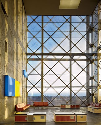
Although the rectangular podium itself is stark and blocky in comparison with the garden and tower, Gang softened the effect with two large concrete staircases that link the upper street level with the lower Harbor Park: One is a switchback stair, the other a spiral. On the east face of the podium, Gang inserted nine town houses, for which she designed interior finishes. She also executed finishes as well as furnishings for a model town house nearing completion.

Rectilinear floor plans and a squared podium are pro forma. What advances architecture at Aqua is the inventiveness of its swerving tiers of concrete, which not only heighten the tower’s livability for the occupants, but add to the appearance of the cityscape for Chicagoans. Yet the optical play is not without drawbacks: The visual appeal of Aqua’s curves works best close-up or at mid-distance, and on a bright, sunny day when the gleaming glass adds luster to the sinuous balconies. However, from a distance, and on a gray day, the curves flatten into straight lines, the white concrete darkens, and the ponds of glass turn into irregular swaths of patchwork. As an optical experiment—as a machine for viewing (looking at the city from the tower, and at the tower from the city)—Aqua is enchanting, but needs further research.

Friday, October 1, 2010

National Stadium of Sports Affairs Council


Toyo Ito raises the bar for sports facilities with his graceful, sustainable design for the National Stadium in Kaohsiung, Taiwan.

By Naomi R. Pollock, AIA


In a fitting match of design and program, Toyo Ito performed a feat of architectural athleticism with his National Stadium of the Sports Affairs Council in Taiwan. Combining the grace of a ballet dancer with the strength of a body builder, its lithe, sinewy form encircles a playing field, while its brawny concrete and steel components do the heavy lifting. Located in Kaohsiung, a city of 1.5 million people 234 miles south of Taipei, the 40,000-seat arena (Ito’s first work in Taiwan) opened in time for the 2009 World Games, which took place from July 16 through 26.

Having teamed up with the Japanese design and construction company Takenaka Corporation plus architects Ricky Liu & Associates and Fu Tsu Construction Company, both of Taiwan, Ito won an international competition held in 2005. The objective of the clients, Taiwan’s National Council on Physical Fitness and Sports and the Kaohsiung Bureau of Public Works, was to erect a stadium with a 1,300-foot-long track and a soccer field that met the specifications of the Fédération Internationale de Football Association and the International Association of Athletics Federation while complying with local government guidelines for integrating green building technology.

In addition to satisfying these criteria, Ito’s goal was to revamp the typology’s closed, concentric parti by opening the arena to the landscape and loosening up its form. “Usually stadiums are very static and symmetrical, but this time we wanted to make a more fluid and dynamic shape,” explains Ito.

Located on the grounds of a former navy base north of downtown Kaohsiung, the stadium begins with a long “tail” that greets sports fans, who mostly approach from the subway station nearby. Containing ticket booths and concessions shops, this appendage starts out small in section but expands steadily as it ascends the ground’s gentle slope. When the land levels off, the tail merges with the arena’s top-heavy body: a soaring, C-shaped grandstand that whips around the field and terminates abruptly at the “head.”

Holding upper and lower seating areas (plus room for an additional 15,000 temporary chairs), the arena opens to an internal lawn on the south, and the main gate connects to a broad terrace fanning out in front. “You can stand outside and still sense what is happening on the field,” says Chih Hsun Su, deputy chief engineer in the Construction Office of the city’s Public Works Bureau. The stands’ energetic form is secured in place by a concrete base containing two partially underground levels, both below grade at the building perimeter but open to the sunken playing field in the middle. The upper basement contains parking, administrative offices, and VIP suites that open onto box seats; the lower basement has prep areas for the athletes and more parking.

As in many Ito-designed buildings, the stadium’s architecture and structure are essentially one. Since the arena has little need for full enclosure, a series of massive structural elements, each one clearly articulated and connected to the next, defines the building. The sequence begins with the piles and raft foundations. These support the basements’ reinforced-concrete slabs and walls, which provide lateral stability as well as vertical load distribution. Most of the downward force comes from the concrete saddles above. Interspersed with openings and aligned like vertebrae, these monumental arches create the stadium’s double-decker circulation spine. Their irregular forms—nine different types in the body of the building alone—were made of poured-in-place concrete, as were the shoulder-angled beams supporting the upper seat decks and the roof.


Bolted to the saddles and the beams are 159 cantilevered steel trusses. Arranged radially, they extend out over the seats and hold up the roof. Tying the trusses together, 32 oscillating spirals of steel pipe stand out as the exterior’s most distinctive feature. Composed from hollow pieces measuring 13 inches in diameter and 20 feet in length, the tubes were factory made to Ito’s 3D specifications. Once welded together on-site, the pipes take on an entirely new character. Crossing over and under the trusses, they imbue the entire stadium with a sense of movement.


In addition to their strong visual impact, the coiled steel members act as lateral bracing that holds the framework for the 229,314-square-foot roof. This intricate, scalelike surface shades the spectators with its 6,482 aluminum-framed glazed units. It is also a massive solar collector, as 4,482 of these sections contain pairs of 4-foot-square solar panels. Tempered glass plate of variable length mediates the energy-gathering units’ rigid flat shape and the stadium’s irregular, curved geometry.

“Connecting these 2D and 3D elements was extremely difficult,” says L.P. Lin of Fu Tsu Construction. In locations unsuitable for solar-energy collection, the glazing is made entirely of tempered glass. Rubber gaskets smooth out the roof’s plane, while narrow troughs (or gutters) gather rainwater and direct it to underground cisterns supplying the soccer field’s irrigation system.

The largest solar-energy-generating stadium in the world, the building produces 1.1 million kilowatt hours annually—many times more energy than it needs. As a result, the system funnels the excess directly to the Taiwan Power Company, eliminating the need for costly and space-consuming storage batteries. When the stadium hosts a major event, it simply buys back extra electricity for lights, air-conditioning, and twin JumboTron screens. Furthermore, according to Fu Tsu Construction, the solar panels are responsible for reducing the building’s CO2 emissions by as much as 660 tons annually.

Another beneficiary of the sun is the grass field. To ensure that the lawn gets its required daily exposure of 5½ hours, the stadium’s long axis tilts 15 degrees north-northwest. This orientation also keeps most of the bright rays out of the athletes’ eyes—an important consideration that could impact the outcome of the game. Of equal concern was the ability to control the wind. Because the stadium opens to the south, it is able to corral the strong gusts that buffet the site during Kaohsiung’s scorching summers. While the resulting natural ventilation maintains comfortable temperatures for spectators, breezes are likely to disturb play. To prevent such mishaps as the ball blowing around during a game, the architects embedded the field into the earth.

Visually, the verdant plain relates to the grass-covered slope inside the stadium as well as the grounds outside—a mixture of existing and newly planted trees. “We wanted to attract the public with a new urban park typology,” explains Ito.

Nevertheless, while landscaping mollifies its impact, the voluminous building hardly blends with the residential neighborhood around it. Yet no one seems to mind. On the contrary, Ito’s landmark has invigorated the area and is a big score for Kaohsiung.

Copenhagen Concert Hall


By Suzanne Stephens

How you react to the Copenhagen Concert Hall, which opened last January, depends on when you see it — and what you are expecting. Because of Ateliers Jean Nouvel’s design approach, both the container and the auditoriums and spaces within assume a vastly different character depending on the time of day you visit. The building, which belongs to Danish Radio and is the home of the Danish National Symphony Orchestra, sits on the outskirts of historic Copenhagen. From the outside in bright light, it looks like nothing more than a large rectangular box that for some reason is swathed in electric-blue scaffolding net and plopped down in an industrial landscape. When the sun goes down, it is transformed into an ethereal, dematerialized object with images of musicians eerily flitting across the screens of glass fiber with a PVC coating. The multilevel interior foyer also changes personality by day and by night. In broad daylight, the main lobby looks like an airport from a 1940s war movie, where sun streams through large window walls and illuminates the dark concrete floor and military-style furnishings designed to resemble flight crates for musical instruments. At night, the tough-glam lobby takes on the iridescence of a multimedia nightclub, with projections splashing polychromatic patterns and videos across various surfaces.

Neither its day- nor nighttime persona gets you ready for the large concert hall. Seating 1,809 and raised above the lobby, it looks in section like some giant clam caught among pilings within a huge (190 by 315 feet) blue cage, 148 feet high. Yet when you enter the auditorium, you discover an expansive and warmly resplendent interior.


Here in the orchestra hall, trays of seating fan out from the stage in the vineyard formation that Hans Scharoun pioneered with his Berlin Philharmonie (1963) and that Frank Gehry handsomely reprised in his Disney Hall [RECORD, November 2003, page 134]. The Danish client was enamored of Scharoun’s Berlin solution, where seats in balconies wrap the stage and create a more intimate listening experience. Nouvel called in Yasuhisa Toyota of Nagata Acoustics (page 74), who was also the consultant on Disney Hall, to design a space that could provide the right mix of direct and reflected sound with the appropriate reverberation time, and ensure a sense of clarity without dryness. Angled walls of CNC-milled birch-veneer board with textured grooves provide reflectivity and absorption, supplemented by “wave” walls of layered gypsum board in the upper part of the auditorium. In addition, lacquered birch-veneer panels on the ceiling and a sound reflector canopy over the stage modulate the acoustics in the hall where the ceiling soars to a height of 77 feet. With the birch walls stained a warm chestnut tone and the wave walls imbued with lush reddish and ocher tints by decorative painters Alain Bony and Henri Labiole, the room has the roseate candlelight glow of traditional concert halls.


While Nouvel placed this largest hall in the upper reaches of the building, he sank three smaller music spaces about 8 feet below grade. The largest is a 540-seat rehearsal and concert hall (Studio 2); the next is a flexible black box (Studio 3), which accommodates 170 people standing or sitting for various musical fare; and a small, red concert hall that doubles as a production studio for 180 people (Studio 4). The three ancillary performance halls reveal distinct acoustical capabilities. Four strata of birch-paneled sliding doors in Studio 2 heighten the reflectivity of sound for orchestra rehearsals. In Studio 3, black gypsum-board wall panels open to absorb sound and provide a short reverberation time. Finally, in Studio 4, red aluminum-and-felt panels pivot for acoustical flexibility, for both recording and rehearsal use. Numerous music rooms, offices, and archives placed on the north end of the building supplement the performing arts spaces, and receive additional light by virtue of an elevated, outdoor courtyard.

Jean Nouvel won the competition (over Rafael Moneo, Rafael Viñoly, and Snøhetta) to design the approximately 592,000-square-foot concert hall in 2002, a fourth component of DR City, a 1.42-million-square-foot complex for Danish Radio’s offices, TV, radio, and orchestra productions. Clustered on a barren site being developed by Copenhagen, DR City acts as a gateway of sorts to Ørestad, the new residential, office, and school development connected to downtown by an elevated metro that whizzes by the concert hall. As the area fills in, it might look more appealing, but now it’s stark: You can’t help thinking some of the concert hall’s facades would be better off with the vertical vegetal wall Patrick Blanc created for Nouvel’s Musée Quai Branly in Paris [RECORD, February 2007, page 86].

Nouvel’s strong performing arts reputation rests on his well-received Cultural and Congress Center built in Lucerne in 1999 and the massively sculptural cobalt blue Guthrie Theater in Minneapolis [record, August 2006, page 108]. Here in Copenhagen, Nouvel continues his interest in surface play à la Guthrie, where photos of historic theater luminaries appear screen-printed on the aluminum-paneled skin. Here, Nouvel opts for a dematerialized envelope, where the glass-fiber skin is draped over a steel Vierendeel frame and a tension-cable-grid system supporting glass panels.

The poured-in-place concrete structure for the concert hall enables the largest auditorium to be carried like a basket by three stair cores of poured-in-place concrete. Between the south and west cores, a bridge of poured-in-place concrete supports the weight of the bowl above, which spans 115 feet. Additional steel supports fill out the structural framework for this bold form.

In creating a parti where the concert halls are discretely articulated masses embedded within a glass-fiber-and-steel cage, Nouvel uses lighting to further blur the boundaries between the contents and the container. Working with lighting designer Yann Kersalé, Nouvel makes elaborate use of a fusillade of equipment, including 1,600 LEDs embedded in a perforated acoustical ceiling, plus a range of slide and video projectors for the abstract and figurative imagery. In addition, accent lights in the form of boxy “pillows” illuminate the idiosyncratic concrete wall panels cast with a wrinkled elephant-skin surface. Lighting in the main, 990,000-cubic-foot auditorium is equally important: Floor lamps with frosted-glass coverings emphasize the geometry of the slanted, textured walls, while a band of light in the upper portion of the hall brings out its contours.

But when lighting is everything, the person/machine at the switch plays a dominant role in setting the mood. This observer attended a design awards ceremony in August where the lighting in many areas resembled a New York subway, and the lobby seemed extremely dim, without sizzle. Inside the auditorium, the ambience of a romantically crepuscular setting witnessed in an earlier visit was destroyed by the harsh light emitted from large video screens. Furthermore, spotlighting on the upper wave walls made the decorative painting look straight out of Disneyland.

But that was one particular night, absent a full orchestra concert. In terms of music, the reception to the acoustics seems positive: six months after the opening, Mark Swed, music critic for the Los Angeles Times, wrote that it has “Disney’s special acoustical cocktail of powerful rich bass, clarity, delicacy, and spine-tingling immediacy.”

A visually based assessment will tend to be schizoid—but so is the building, with its scaffoldinglike blue cage by day and fun-house lighting at night. Indeed, you wonder if it was worth the much-talked-about budget overruns (the building reportedly cost $325 million)—except for the grand, lush, major hall, and the handsome, smaller music studios.

Wednesday, September 29, 2010

Dee and Charles Wyly Theatre


By David Dillon

With its rippling aluminum facade and crisp cubic form, the Dee and Charles Wyly Theatre is an edgy presence in Dallas’s refined brick-and-stone Arts District. Corners peel back to expose massive X braces; floors cantilever at gravity-defying angles. Instead of flowing out like a traditional theater, with the stage in the center and support spaces to the sides, the Wyly pushes up, nine stories, with the lobby in the basement, the stage on the street, and rehearsal studio, costume shop, offices, and classrooms snapped together above like a transformer. The “vertical city” meets the Texas prairie.

A centerpiece of the $354 million AT&T Performing Arts Center, the Wyly is a surprisingly small building, barely 90,000 square feet. Across the street stand I.M. Pei’s swirling Meyerson Symphony Center and Foster + Partners’ Winspear Opera House, with its thrusting sunscreen and blood-red performance drum. Knowing that their building would be upstaged by its more flamboyant neighbors, Joshua Prince-Ramus and Rem Koolhaas opted to play to the office towers behind instead of the low-slung cultural buildings in front.


“Verticality helped us acquire an identity,” says Koolhaas. “The building belongs both to the cultural complex and to the rest of the city.”

The Wyly’s tubular aluminum skin, reminiscent of a pleated theater curtain, transforms it into a Minimalist sculpture on a low, grassy pedestal. But the rain-screen skin is only one part of the story. The architects set out to reinvent the contemporary theater by designing a performance machine. Equipped with an elaborate system of winches, pulleys, lifts, tracks, and catwalks, the structure can be reconfigured from a proscenium stage to thrust or flat floor in a matter of hours instead of days, dramatically reducing labor costs. While this is common in sports arenas and convention centers, the technology has never been used quite this way. Balconies fly up into the ceiling at the touch of a button; aisles can be rearranged between acts; the audience may sit on the floor at the beginning of a performance and on stage at the end.

“Going up allowed us to free the ground plane so that control of how the play is seen or changed passes to the director instead of the building,” explains Prince-Ramus.

Early reports have been enthusiastic. “Everything you’ve heard about the flexibility of the space is true,” wrote Dallas Morning News theater critic Lawson Taitte. “The machinery has worked beautifully.”

“It is exactly what we were hoping for,” adds Wyly artistic director Kevin Moriarty, “which is not to say that it will appeal to everyone or that it will work for any play. It was certainly not conceived as a home for 19th-century-style productions.”

The only complaints so far have been butt-bruising seats, poor sight lines in parts of the balcony, and, more frequently, the building’s perverse Chutes and Ladders entrance. Instead of entering directly from the street, patrons must walk down a sloping concrete ramp to the lobby, then back up a narrow interior staircase to their seats. This sequence stemmed from the architects’ desire for a totally flexible performance space, which meant that the lobby had to go below. (An early scheme showed the glass walls wrapping the stage folded up like garage doors, allowing patrons to spill out onto the plaza at intermission.) “Their thinking was that five minutes of inconvenience in the lobby was worth two hours of excitement onstage,” says Kevin Moriarty.

Yet the ramp is steep, hard, and unwelcoming, and with cars entering and exiting, dangerous as well. It also makes a large curb cut on Flora Street, the district’s main drag, while eclipsing views of the Winspear and the Meyerson on the other side.

Once inside, however, patrons find a sophisticated high-tech space. No sofas, velvet drapes, and warm, soothing colors here—only mute concrete floors and walls; sleek, stainless-steel-paneled overhangs; and bare fluorescent tubes suspended from the ceiling like light sabers. This is tough, “take that’’ interior architecture, occasionally crude in its execution yet carried through with the consistency of a serious aesthetic rather than a glib decorator flourish.

And in spite of its aloof, self-absorbed attitude, the Wyly still manages to engage the city at several levels. When a performance ends and the curtains part, audiences get a framed view of the passing parade on Ross Avenue, a major gateway to the Arts District. Likewise, the black-box theater on the sixth floor offers a synoptic glimpse of the rest of the district, with the Winspear bracketed by the Meyerson and Allied Works’ new Booker T. Washington High School for the Performing and Visual Arts [record, January 2010, page 100]—classical music, opera, and theater doing a line dance. And from the balcony of the 9th-floor rehearsal hall, trimmed out in green artifical-grass carpet and fiberglass trellises, visitors have a panoramic view of downtown Dallas, with the historic Guadalupe Cathedral in the foreground and the skeletons of spec office buildings off in the distance. Past, present, and future, art and commerce are compressed into a single image.

With only two productions so far, one the opening gala, it is too early to say how the Wyly will ultimately perform. Kevin Moriarty predicts it will take five years to know what it can and cannot do. “We’re going to assault the building relentlessly to discover its limits,” he says.

It is clearly a director’s theater, a laboratory for the new and surprising, and it will certainly redefine what a night at the theater means for Dallas audiences. Like much of both architects’ work, it is provocative rather than pretty, a gutsy roll of the dice. In a 21st-century arts district, that’s a good role to play.